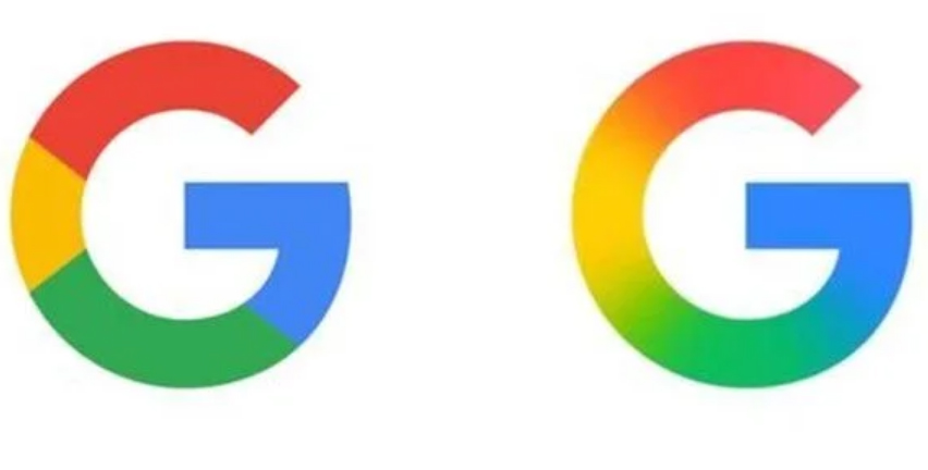
Google has revamped its iconic ‘G’ logo for the first time in nearly a decade, introducing a gradient design that enhances color balance and depth. This update is already live on the Google iOS app, with plans for Android and other platforms yet to be confirmed.
The new logo retains the ‘G’ in the familiar Product Sans format, it introduces significant changes to the colour scheme.
While the old logo featured four solid colours (red, yellow, green and blue), the new one uses a gradient design that blends the colours more organically, adding depth and polish. The colour distribution and gradient blending also make the new logo appear more balanced.
The new Google logo was rolled out on Sunday 10 May as part of an update to the Google iOS app. Meanwhile, a similar update to the Google 16.8 beta app added the new colours to the iconic ‘G’ logo on Android, according to 9to5Google.
The tech giant has not yet revealed whether the new logo update will also apply to the six-letter ‘Google’ logo. Google has also not confirmed whether the new logo will be adopted for its other apps, such as Chrome or Maps.
While we are yet to receive an official explanation as to why the new Google logo has been changed, it seems that the tech giant wants to establish a separate brand image in an era where most of its products have now been integrated with AI.


